|
The majority of consensus forecasts in ShareData™ are supplied by stockbrokers, independent analysts, and financial
intermediaries. They do not necessarily reflect the
projections or targets of the listed company. The
consensus view is calculated by ProfileData based on
the views supplied.
Forward Price Projections
We calculate a forward price vector based on the best and worst earnings estimates for the company, using either the historical P/E of the share or the sector. It is important to realise that this projection is in no way a prediction of where we or anybody else believes the share price is going. It is simply a calculation which says, “If this earnings estimate comes true, and if the share enjoys this historical P/E, then this is where it will trade”. Both the future earnings of the share and its future rating (or P/E) lie at the heart of the investment decision, and this is where the investor has to take a view. ShareData Online simply provides an illustration of one possible range of outcomes.
You will notice that the forward price projections are based on either the historical share P/E or the historical index P/E, and over anything from three months to two years. The algorithm used to determine these variables uses the historical P/E of the share provided this is within 200% of the average index P/E. If the share's P/E is too high, the program uses the index P/E. The rationale for this is that very high ratings are difficult to sustain, and tend, over time, to move back towards the index average.
Historical P/E Range
The Historical P/E Range chart shows the P/E stability for each share over five years based on year-end data.
The highest and lowest P/Es (as calculated by ProfileData) for each of the last five years are extracted from the ShareData™ database. The chart shows the average P/E and the average high and low. This enables you to see the volatility of a company's P/E and the extent to which the P/E range stays within the five year historical averages.
From an interpretative point of view, this chart helps you form an opinion about the reliability of forward price projections - the more stable the historical P/E range, the more likely that forward price projections can be relied upon.
Forecast Graph
The forecast graph shows the share price relative to the share's historical P/E ratio. In addition, it is a forward projection of the share's price based on historical P/Es and consensus forecast earnings. Weekly closing prices are used where more than three years data is available. For less than three years, daily data is used.
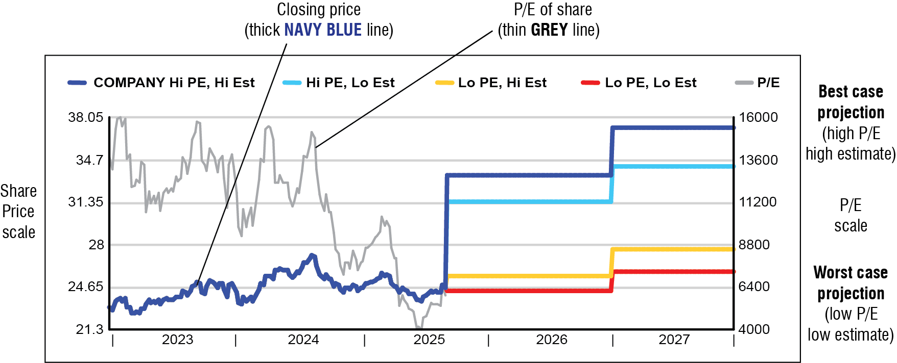
The example above shows the elements of each graph. The thick NAVY BLUE line is the daily or weekly closing price of the share (left hand scale). The thin GREY line is the share's P/E (right hand scale).
The share price projections are based on the forward price calculations found below the consensus figures. The top NAVY BLUE line represents the potential price if the highest earnings estimate is achieved and the share enjoys a high rating (i.e. high P/E, high earnings estimate). The bottom RED line shows the potential price if the worst case earnings estimate comes true and the share suffers a poor rating (i.e. low P/E, low estimate).
Please note that these projections are not a prediction of future share prices, only an illustration of the possible price at historic P/E levels if earnings estimates prove to be true.
|